Aurora Energy: electrical outage communications
Aurora Energy needed a public outages map for 87,000 customers in Otago — their most critical communications tool and the only touchpoint most customers ever had with the company. I led research and designed the map around a single operational reality: when the power goes out, the phone is the only device available. The result eliminated media enquiries entirely and reduced outage-related call centre load by at least half.

- Client
- Aurora Energy
- Project Type
- Website Re-development
- Role
- UX Designer
- Timeframe
- 4 months
- Team
- Product Owner, Project Manager (1), Software Engineers (3)
The brief
Aurora Energy maintains electricity infrastructure for 87,000 customers in Otago, New Zealand. A power outage is the only moment most customers ever deal with the company directly — and there was no public tool for them to self-serve when it happened. I led research and designed the outages map from scratch, as lead designer on a wider website redesign.
The problem
Faults and outages were the single highest call type in Aurora’s call centre — spiking sharply during widespread events, overwhelming the team at exactly the moment they needed to focus on repairs. Customers had nowhere to go for accurate information, so they called.

What I designed
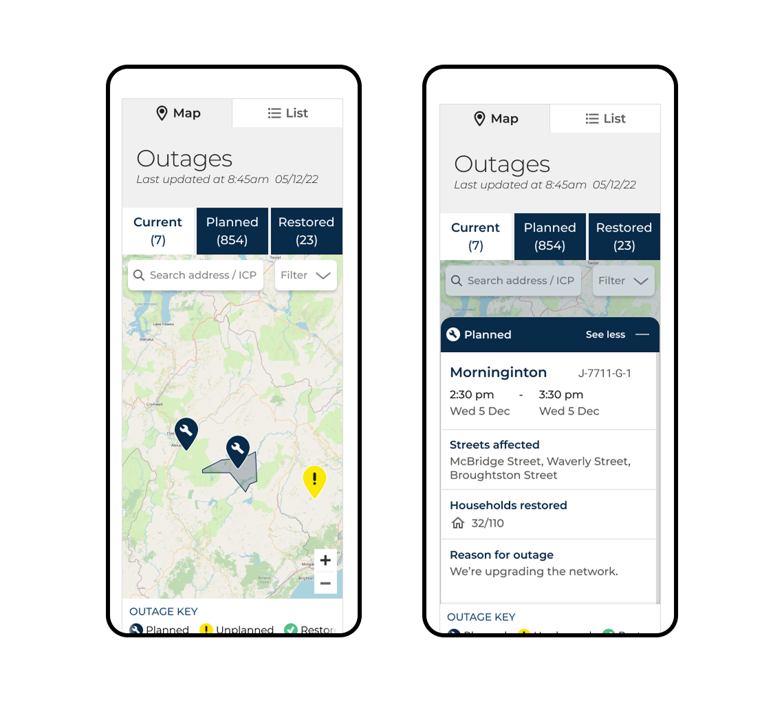
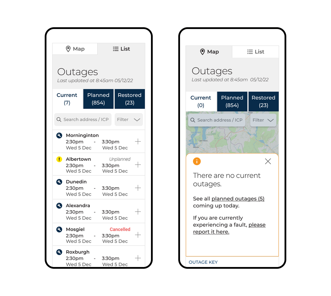
A mobile-first map built around one operational reality: if the power is out, the laptop is unavailable. Outages placed directly on the homepage — one page load, no navigation required during a crisis. A drawer interaction that preserved map context while revealing outage detail. An accessible list view alongside the map for users who couldn’t use it.

Results
“The only time I have interacted with Aurora was when I had a planned outage.”
Aurora Energy customer
Full Case Study
Behind the outcomes
Outages represented a third of all Aurora Energy site traffic — outside the homepage, no other page exceeded 5%. During widespread events the call centre was overwhelmed with customers who had nowhere else to go for accurate information. I was the lead designer on a wider website redesign, owning research design and execution, IA, and all UX decisions for the map end-to-end.
Research: two things that changed the design

Eight interviews across residents, business owners, contractors, and older adult advocates surfaced findings that directly changed design decisions. I ran the research end-to-end — from recruitment through to analytics — and brought the same panel back for usability testing, so validation was grounded in the same people whose needs shaped the original design.
Two findings mattered most:
Accuracy over speed. Customers don’t expect instant fixes — they expect honest information. Inaccurate updates, disappeared alerts, or missing context cause significant frustration. Knowing that something has changed — even for the worse — is preferable to uncertainty.
Planned = plannable. Planned outages are acceptable because they’re manageable. Unplanned outages without information are not.
My colleague and I ran a persona workshop with internal stakeholders to build shared alignment on Aurora Energy’s diverse users before moving to design.
When the power goes out
Almost every participant in the research described mobile as their default during outages for one reason: if the power is out, the laptop is unavailable. Every interaction had to work on a phone, by someone whose power was already out.

The first wireframes placed outages directly on the homepage — one page load, no navigation required. Competitors typically opened maps in a separate application — a full-screen experience, but one that required an extra navigation step at exactly the moment a user with no power can least afford it.

Why the drawer won

The outages map needed to function within Aurora’s website as a content block — not a standalone application. This created a specific interaction problem: how do you reveal outage detail without losing map context?
I evaluated three approaches:
Modals disrupt spatial orientation. The user loses their place on the map — in a crisis context, this creates unnecessary re-orientation.
Popups create nested complexity. An embedded map already has limited interaction surface; a popup within that space compounds the problem and risks obscuring the surrounding map context.
Drawer preserves orientation while revealing detail. The user can see both the map and the outage information simultaneously. The map doesn’t disappear — it narrows. For a crisis decision, this matters: the user can verify they’re looking at the right area while reading the detail.
Accessibility as a design decision

Embedded maps don’t provide an accessible experience for all users. I included a list view — not primarily because users preferred it (testing confirmed the map was the default) but because it was the right call for the users who would need it most and couldn’t use the map.
This decision had structural consequences beyond the accessibility case: including a list view required a map/list toggle, which then influenced where every other UI element lived — search, outage tabs, and legends all fell into place around that toggle.
What testing changed


I brought six participants from the original research panel back for usability testing — their responses were grounded in the same context and expectations they’d described earlier.
Four specific changes came from testing:
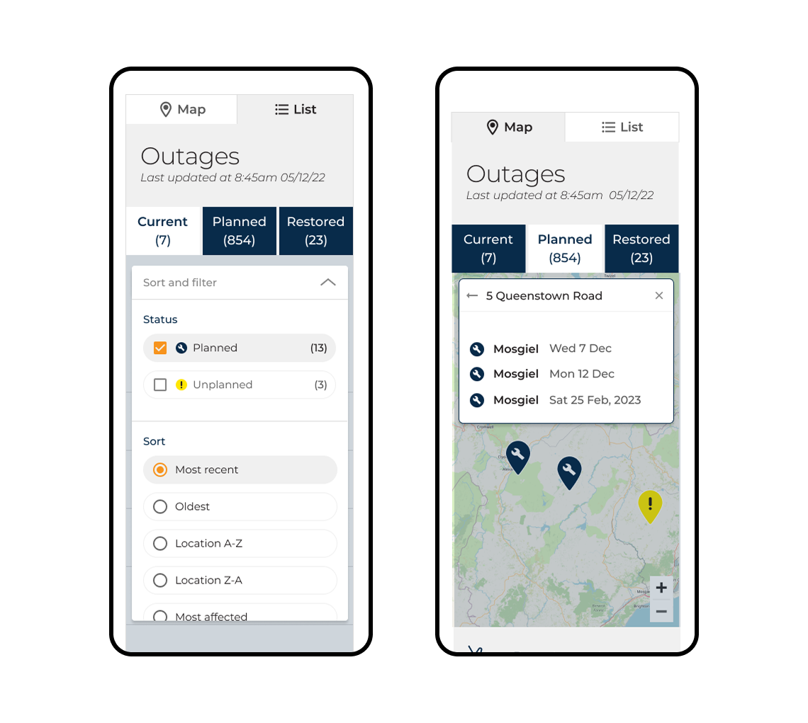
Zoom reset button. Users were getting lost at high zoom levels with no easy way to return to their area. We added a zoom-out control.
“See more” cue. Users weren’t discovering that the drawer could be expanded. Adding text alongside the expand icon particularly helped older participants less familiar with the icon pattern alone.
Suburb labels. The list view was rendering as an undifferentiated list of street names. Adding suburb context to each entry gave users enough orientation to identify whether an outage was near them.
List view confirmation. Testing confirmed the map was the preferred default — which validated the toggle structure and removed pressure to make the list view the primary view.
Impact
Media enquiries for outages were eliminated entirely. Outage-related call centre load fell by at least half. The design set a New Zealand industry standard for the level of information provided to customers during power emergencies.
Final designs
Reflection
I’d instrument the map more thoroughly pre-launch — task completion rates and real error rates would have strengthened the impact case. The at-least-half call reduction is the headline outcome, but without baseline measurement I can’t directly attribute it to specific design decisions. I’d also add unmoderated testing simulating the high-stress scenario: mobile only, no instructions, find your address and determine when power will be restored — the closest approximation to the real crisis context I was designing for.
What this project changed about how I approach information hierarchy: when someone’s power is out and they’re on a phone, they can’t evaluate three equally-weighted options. The drawer wasn’t just an interaction pattern — it was a decision to give the user one clear thing rather than a choice between things. I carry that question into lower-stakes work now. If I find myself giving users two equally prominent paths, I ask whether I’ve actually resolved the decision or just deferred it to them.