Kepla: marketing automation for small businesses
Kepla was a bootstrapped startup building marketing automation, initially aimed at digital marketing agencies — the wrong market. As founding designer, I contributed to the market pivot that redirected the product toward small businesses, then designed the core campaign creation system from scratch. The result: a hub-based platform that saves users 5+ hours weekly and has scaled from local SMBs to New Zealand's largest media publisher.

- Client
- Kepla
- Project Type
- 0-1 product design
- Role
- Founding Designer
- Timeframe
- 4 months
- Team
- Product Manager, Lead Developer, Software Engineer
The brief
Kepla was a bootstrapped startup building marketing automation. I joined as the first and only designer — no process, no component system, no brand, no product name. Over four months I contributed to a market pivot and designed the core campaign creation system from scratch.
The problem
Small businesses couldn’t afford full-service agency fees. Managing all three platforms simultaneously, with separate logins and separate interfaces, made the cognitive load prohibitive. Time was the constraint, not budget.
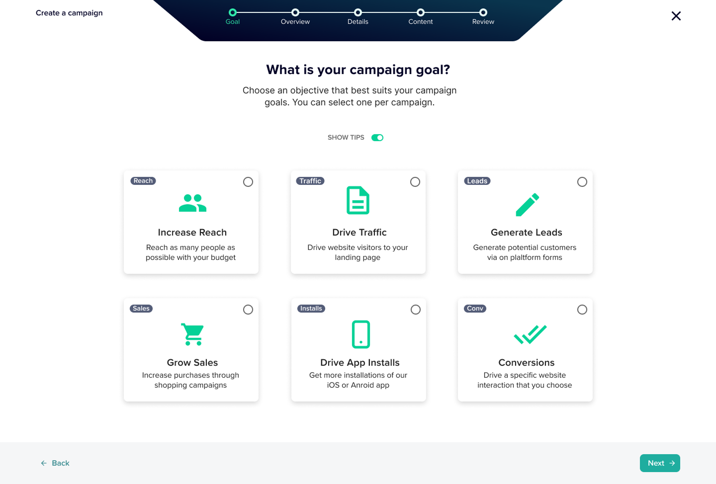
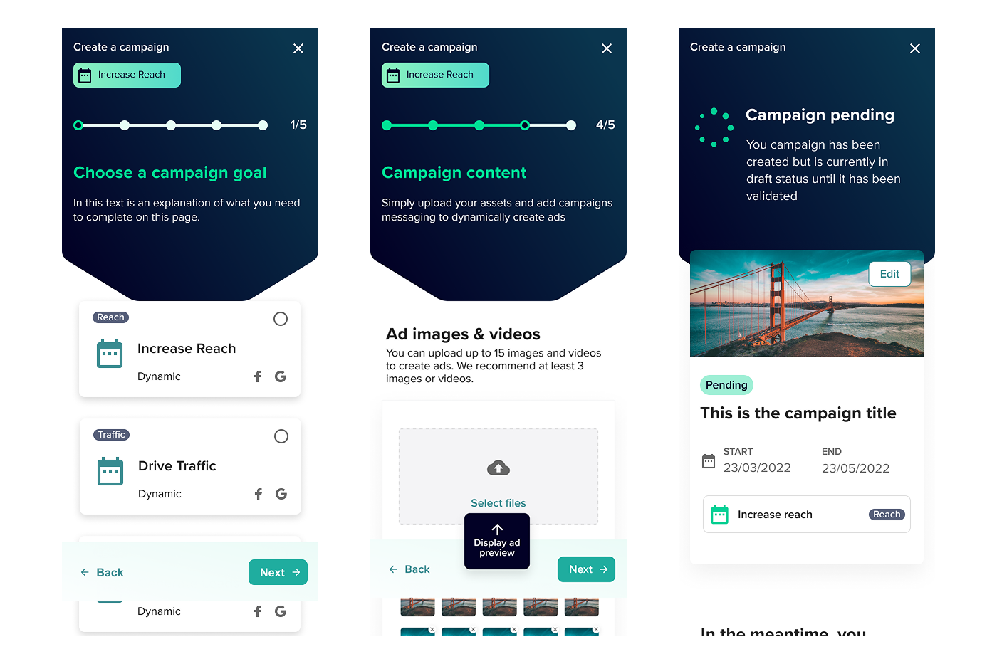
What I designed
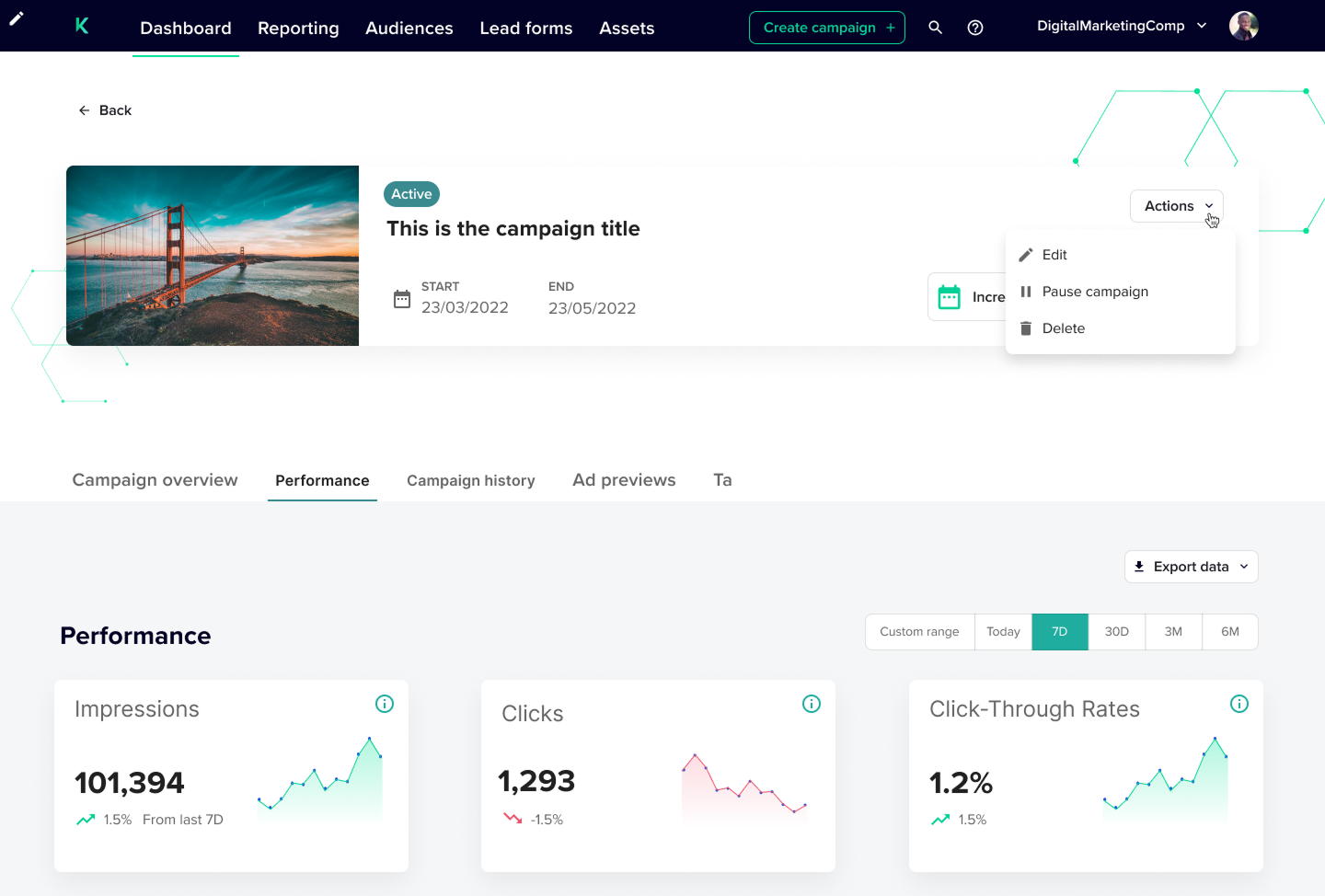
A hub-based campaign creation system: one central screen showing all selected platforms, all created ads, and the overall campaign state at a glance. Platform-specific creation in modals, so users could complete one platform without losing sight of the whole. Live previews on every creation screen — users could see what the platform would receive before submitting.

Results
“Digital marketing seemed daunting at first, but Kepla made it easy and the enquiries just started flowing in. I couldn’t have made a better decision.”
A small business customer
Full Case Study
The pivot and the product
The founders had built Kepla for what they knew — both came from agency backgrounds, and agency was the starting assumption. There was no process, no component system, no brand, and no product name when I joined. Before a line of UI was designed, I identified that SMBs represented a larger opportunity than agencies, and the pivot decision changed what needed to be built.
The market that actually needed this
The founders had built Kepla for agencies — their own background, their own network. Through market scoping conversations, I identified a larger opportunity: SMBs who couldn’t afford full-service agency fees and represented a significantly larger addressable market.
The pivot did more than change the target audience. Designing for agencies required complex multi-account architecture, access rights management, and client-facing views. Designing for a single company account removed all of that — allowing us to go to market faster, with a simpler product that solved one problem well.
The founders already had a network of SMB contacts — the customer acquisition risk of moving away from agencies was lower than it appeared.


Who the user actually was
The target users were either business owners running digital marketing alongside everything else, or staff members tasked with it as a secondary responsibility. Users varied in marketing background — some had traditional experience, others had little to none — but digital advertising was new to almost all of them. Across all three platforms simultaneously, with separate logins and separate interfaces, the cognitive load was prohibitive.
Time was the primary constraint, not budget. The question wasn’t whether SMBs could afford Kepla — it was whether the time investment to set it up would be worth it.
Users could complete the process. They just couldn’t remember what they’d done.

The first approach to campaign creation was a linear wizard: goals, general information, then each platform’s specifics in sequence. Informal testing sessions with early customers revealed the core problem: users could complete the flow, but by the time they reached the final platform, they’d lost track of what they’d selected earlier — which platforms, and what they’d already filled out.
The problem wasn’t the steps. It was the lack of a persistent overview.
One screen to manage all platforms


I redesigned the flow around a hub: a central screen that showed all selected platforms, all created ads, and the overall campaign state at a glance. Platforms were added from the hub, not chosen at the start of a sequential flow. Users could see exactly where they were and what remained — the context was never out of sight.
Platform-specific creation opened as modals — visually distinct from the hub but clearly nested within it, so users understood they were completing one part of a larger whole and could return to the hub without losing progress.

A largely standardised ad creation structure worked across all platforms, with platform-specific fields where the API required them. Users learned the system once and applied it three times.

Dynamic ad previews on the right of every creation page gave users a live view of what the platform would receive — confirmation that the system was creating what they intended before they submitted.
Based on campaign goals, Kepla also suggested which specific ad types to create — removing the decision paralysis of not knowing whether you’d done enough, or where to start.
Two decisions that kept the product on track
Cutting templates. Early designs included campaign templates for running repeat campaigns. User research showed SMBs wouldn’t create enough campaigns to benefit from repeatable structures. I recommended removing templates from the MVP scope — they would have fragmented design and development effort at the most critical stage for a feature the primary users would rarely use.
Designing without a brand. No brand existed at project start — not even a product name. I built on the UI Prep component library and made every colour decision as a named token, planned from day one for a one-to-one swap when brand assets arrived. When they did, integration was fast.

Final designs
Impact
- Users save 5+ hours weekly by eliminating repetitive platform setup across Google, Meta, and LinkedIn
- Platform scaled from local SMBs to NZ’s largest media publisher — same architecture, no rebuild
- Agency market re-entered at scale after the SMB foundation proved the product’s flexibility
- Token-based design system enabled full brand integration without structural redesign when brand assets arrived
Reflection
The most consequential decision on this project was the pivot — and I made it without baseline data, because there was none. Market scoping conversations were the evidence. That was enough to make the call, but I’d want more rigour today: user testing on the first-encounter hub experience (does the mental model land without a demo?), funnel instrumentation in campaign creation before launch, and a written decision record for the pivot so the reasoning could be referenced when the team later revisited the agency market.
The hub solved the “lost in the wizard” problem for users who got through onboarding. What I never tested was what happened when a brand new user encountered it for the first time, without a demo or a founder walking them through it. I assumed the mental model was intuitive — the hub is conceptually unusual enough that I should have verified that with a cold-start session before launch.
Being the only designer accelerates your judgment and exposes your blind spots at the same time. Every decision — including ones that felt low-stakes — was made without anyone to push back on it. The token-first approach to the brand and the early customer testing sessions weren’t process applied from a textbook; they were how I built in the checks a team would normally provide. I’d do it the same way again, but I’d be more deliberate about naming it upfront: these are the mechanisms I’m using to compensate for working alone, and here’s what they’re designed to catch.