SiteSmart: health & safety SaaS for construction
SiteSafe acquired a farming-focused H&S platform and needed to launch it into construction — but the product lacked a defined market, consistent architecture, or a pricing model that fit. I led the audit that revealed the strategic problem, ran the workshops that resolved it, then redesigned the core features around the target that emerged.

- Client
- SiteSafe
- Project Type
- Product re-development
- Role
- Lead Designer
- Timeframe
- 6 months
- Team
- Product Manager, Lead Developer, Software Engineer(2), Analyst
The brief
I was brought in to audit the product. Early in the audit, I recommended we stop.
SiteSafe acquired Zero Harm, a farming-focused health and safety platform, and needed to launch it into New Zealand’s construction industry. As Design Lead at Effect, I was brought in as an external party to audit it. That recommendation, and the workshops that followed, determined what the product would actually be. I led the strategic work, then embedded as the primary designer for six months of redesign.
The problem
Fifty-plus screens with inconsistent interaction patterns was the visible problem. Beneath it was something more fundamental: the product team couldn’t clearly answer who the product was for. Construction was the stated direction, but farming, vineyards, large properties, and industrial sites were all still in consideration. Fixing the interface without fixing this would have meant building the wrong product twice.
What I designed
A market pivot to SME construction, a site-based pricing model that matched how construction businesses actually work, a consolidated Sites page replacing six fragmented entry points, a redesigned Hazards flow that required meaningful safety information rather than accepting empty submissions, and a component system that let the team build new features without reinventing structure each time.

Results
Full Case Study
What the audit uncovered
The product had been built for farming — it was acquired by an organisation whose credibility and mission were in construction. It had been built around farming workflows, with no consistent architecture to rebuild on.
The problem that mattered
Fifty-plus screens with inconsistent interaction patterns was the visible problem. But beneath it was something more fundamental: the product team couldn’t clearly answer who the product was for.
Construction was the stated direction, but farming, vineyards, large properties, and industrial sites were all still in consideration. The existing user personas ranged from farmers to vineyard owners to construction foremen to large property managers. Fixing the interface without fixing this would have meant building the wrong product twice.


Stopping was the right call

I recommended pausing the audit. The client had brought us in for design output. We ran a series of structured workshops with the product team and, at a later stage, the C-suite — covering competitor analysis, market sizing, target user definition, and pricing architecture.


Through competitor analysis and market sizing I recommended narrowing focus to small-to-medium construction enterprises.
SMEs had the same H&S obligations but lacked the resources to run sophisticated systems. Construction also matched SiteSafe’s existing domain credibility and mission — their industry relationships were already in construction, not farming — and competitive analysis confirmed the construction market was the larger opportunity.
Pricing as a design decision


Per-user billing would have made H&S participation contingent on having a paid seat — which conflicted directly with the goal of making safety accessible to every worker on site.
I proposed a site-based subscription: businesses pay per active worksite. Three structural advantages:
Aligns cost with real-world work. A site is a job, and a job has a budget line in construction — ‘Preliminaries and General’ pricing absorbs this cost naturally.
Free for workers. Removing the individual adoption barrier aligned with SiteSafe’s mission to improve New Zealand’s safety culture. Workers wouldn’t pay out of pocket; the main contractor would absorb a small monthly cost to reduce admin overhead.
Network effect. Subcontractors move between sites and companies constantly, carrying their H&S profiles with them. Every site invitation brings a pre-verified worker into the platform.
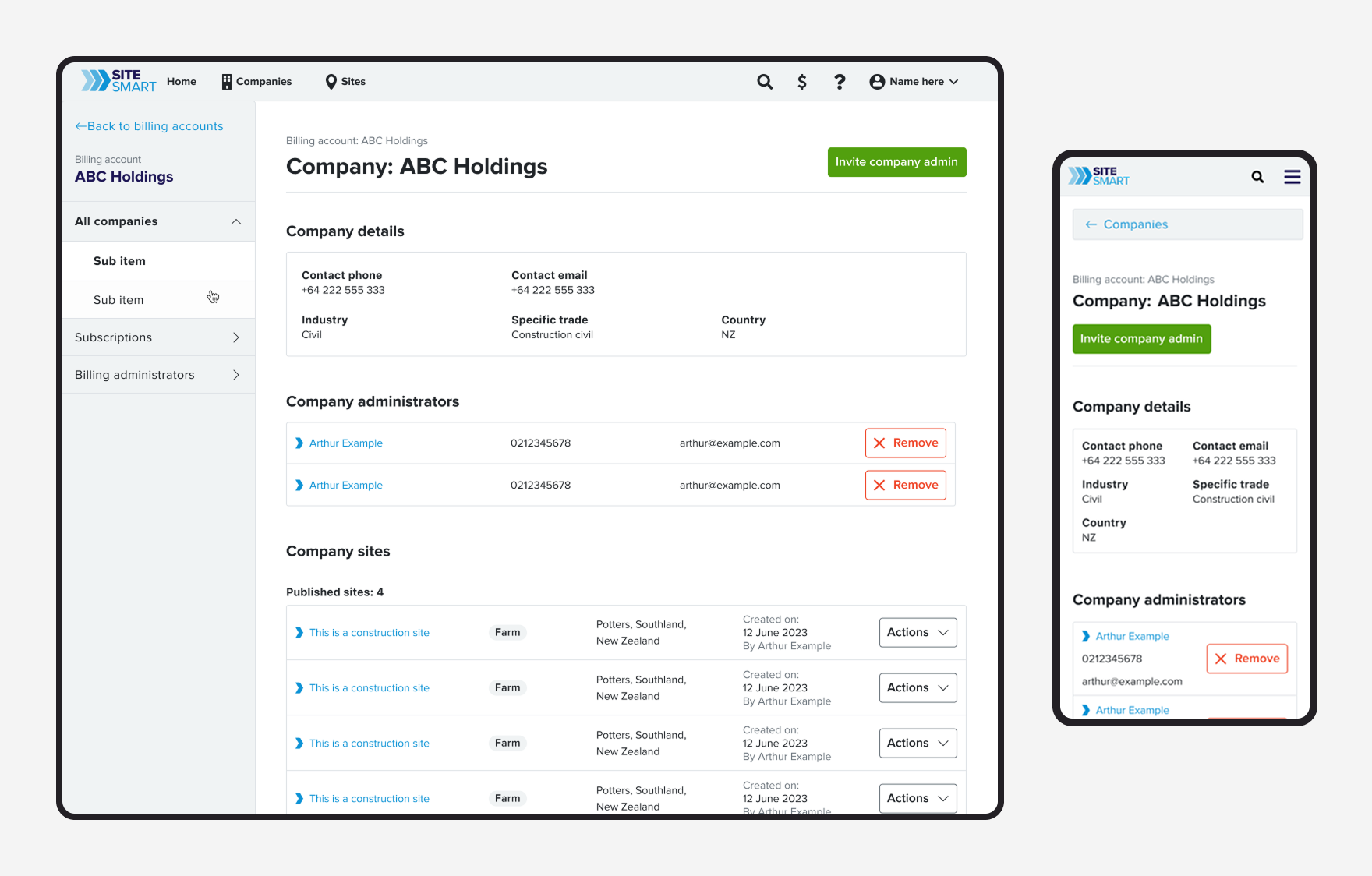
Six ways to reach the same screen


The original architecture had assumed single sites and static roles. Construction users work differently: a foreman might manage one site, contribute to another, and transition a third to a specialist simultaneously.
The binary “Site Administration vs My Workplaces” structure had created six or more entry points to the same information, with inconsistent tables and filters at each one.


I consolidated everything into a single Sites page with a search-first approach. The backend couldn’t merge the underlying data models, so role-based tabs — manage / work / public — handled the constraint without fragmenting the user experience. All other entry points redirected here.
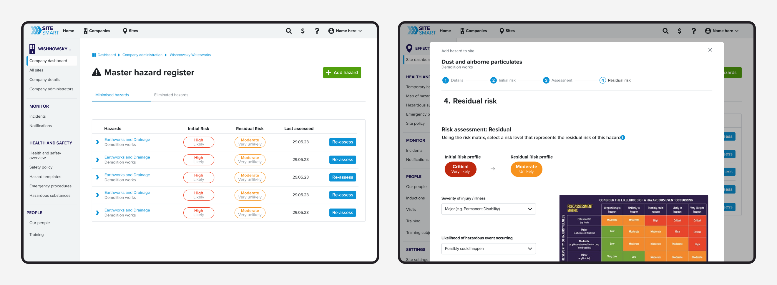
Empty hazards don’t make anyone safer

The Hazards flow had a confusing seven-step structure with inconsistent naming and screens that required users to navigate backwards to complete tasks. Research revealed what this produced: users were adding empty, generic hazards to clear the workflow — selecting a category and submitting without any site-specific information. Completing the form to move on, not to document a real hazard. A list of empty records doesn’t make anyone safer.


I redesigned the flow as a linear wizard that required meaningful safety information before users could progress. The new flow took six steps — one fewer than the original — despite additional legislative compliance requirements being added during the redesign.
I also designed a cross-company hazard management system: company admins can push protocol updates across all sites, with site managers able to adopt or reject based on local conditions.

Design system


The original product had no consistent component model — each feature had invented its own patterns.
I restructured the component library and standardised page types, navigation patterns, and sidebar behaviour across the platform. Engineers had no consistent kit of parts to work from — with the system in place, new features could be built against existing components rather than designed from scratch each time.
Impact
- Research-driven strategy pivot enabled successful construction market entry — the site-based pricing model adopted as SiteSafe’s go-to-market strategy for construction
- Reduced 6+ fragmented site discovery pathways to a single unified Sites page
- Hazards workflow reduced from 7 to 6 steps despite increased legislative requirements; eliminated pattern of empty hazard submissions
- Design system restructure enabled rapid feature iteration and integration of new brand
Final designs
Reflection
The most important decision I made on this project wasn’t a design decision. Recommending we pause and fix the strategy first required making a case to a client who’d hired us for design output. Without it, we would have built a polished product for a market that hadn’t been defined.
Framing the recommendation mattered as much as making it. The client hadn’t hired us to tell them their strategy was unclear — framing the pause as protecting their investment rather than withholding design output was what made it a conversation rather than a conflict. This project changed how I think about the role a designer can play: someone who executes against a brief is useful, but someone who can identify when the brief itself is the problem is rarer. That’s the version of the role I want to occupy.
I measured whether users submitted hazards. I didn’t measure whether they submitted good ones. The real metric was completion quality — did the new flow produce hazards that contained useful safety information, or did users find a new way to satisfy the form without engaging with it? I’d define that quality threshold before building, and instrument for it from day one.